
Edge Database
A globally distributed and scalable Database


Equinix is the world’s largest IBX data center & colocation provider, offering the fastest application performance, lowest latency routes worldwide and a digital ecosystem for financial, content or rich-media, enterprise, and cloud networks. Equinix connects the world’s leading businesses to their customers, employees and partners inside the world’s most connected data centers in 44 markets across five continents. In the United States, Equinix operates data centers in Atlanta, Boston, Chicago, Dallas, Denver, Los Angeles, Miami, New York, Philadelphia, Seattle, Silicon Valley and
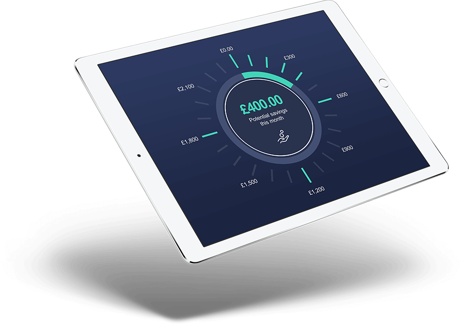
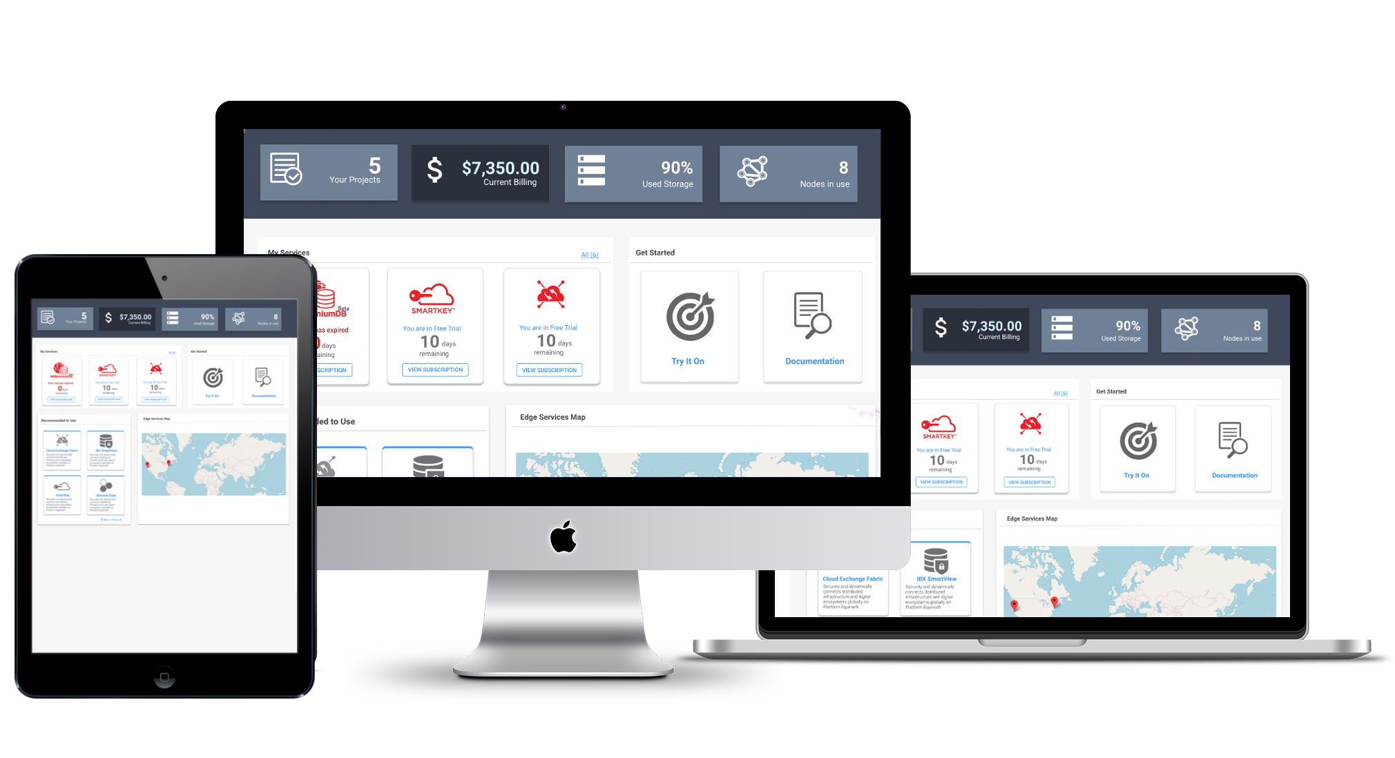
The Service Portal provides simple and unified access to Equinix Edge Services in one place. The user lands on a dashboard where they can access all the critical data in one place. The Portal allows the user to track and control all subscriptions and services, and present the information about current data consumption, storage and expenses. The Map allows the user to see all the locations.
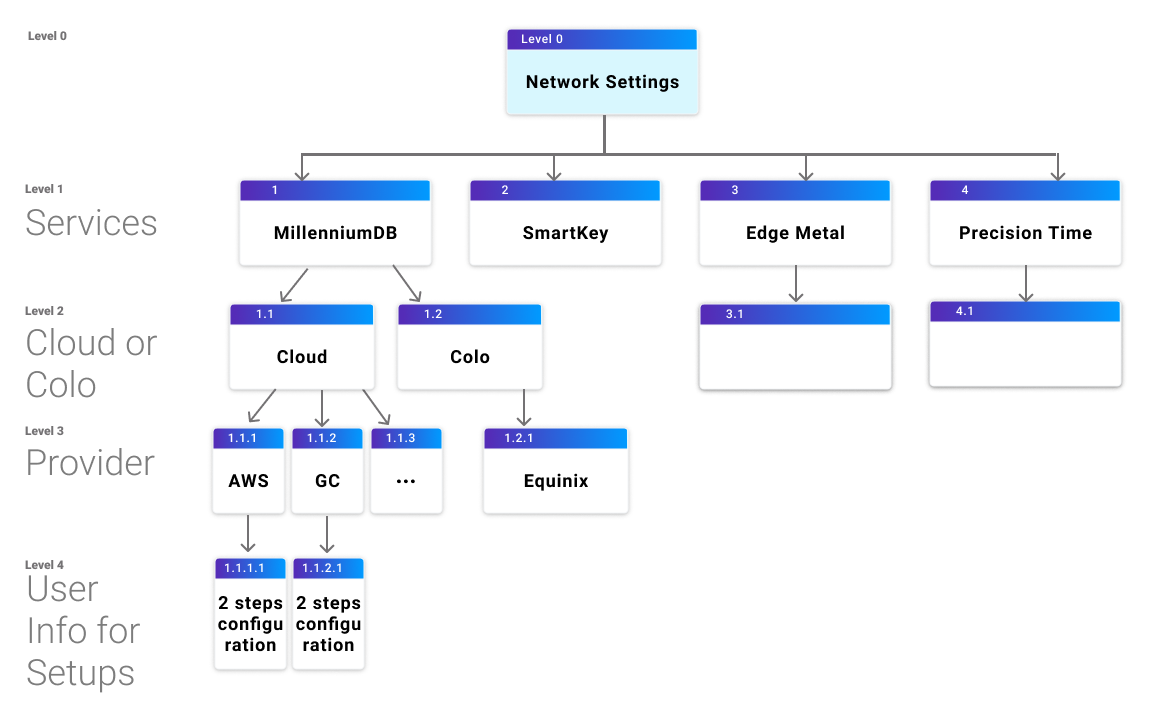
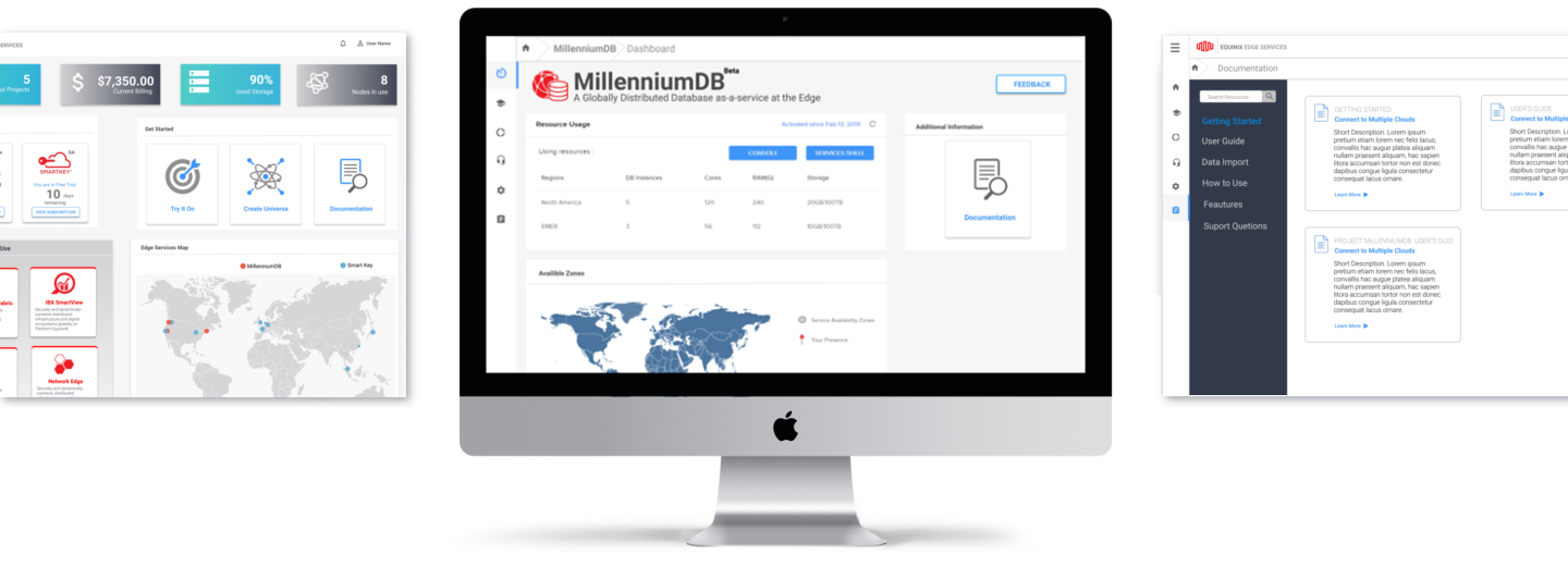
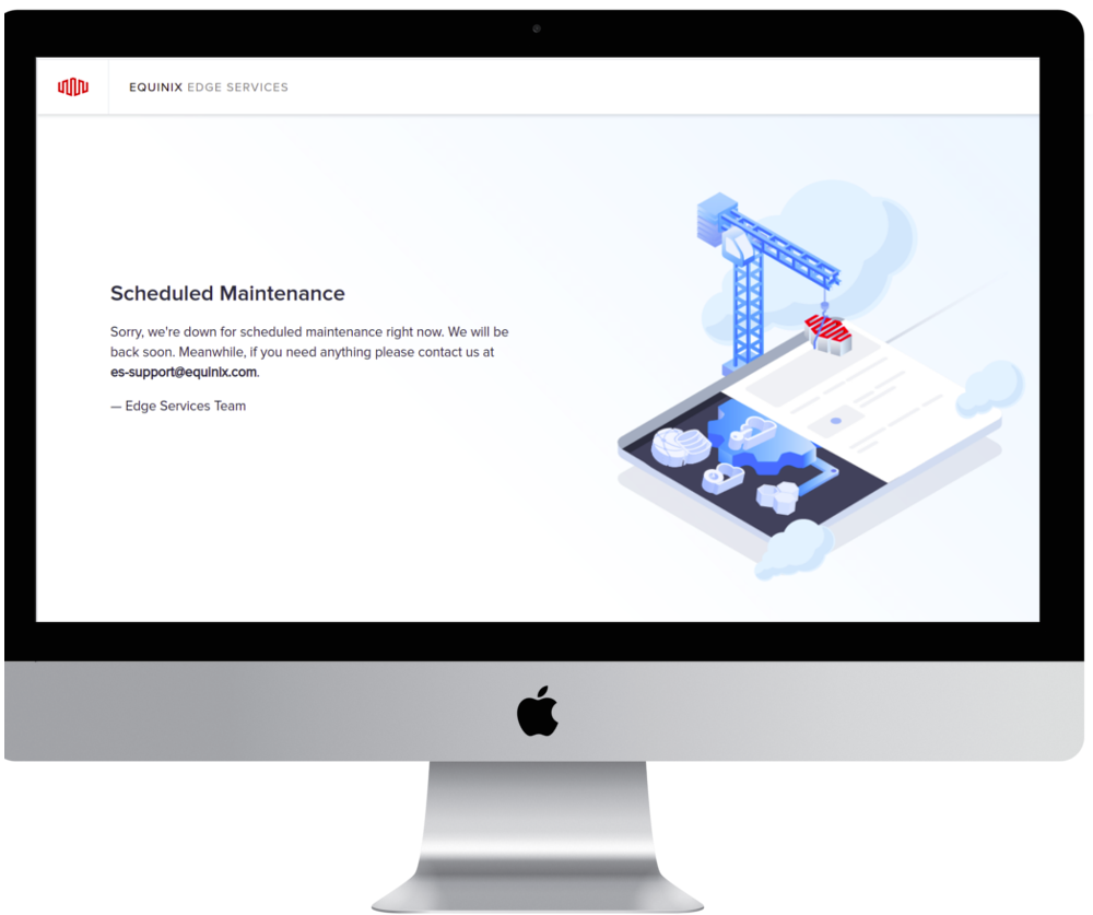
During this Project as a UX/UI designer I made user flows, low- and high-fidelity wireframes, and interactive prototypes. It included a landing page and multiple pages with settings and connections. A big chunk of time was dedicated to unifying the design and style, and the UI elements – buttons, tables, cards, font sizes, etc. I redesigned the navigation bar to a dark theme, which visually separated the navigation bar from the page body, the dashboard, which resulted in 85% user satisfaction. I designed and developed Documentation and Maintenance Pages using HTML, CSS and Adobe Illustrator for graphics.
The Customer Portal has a unified style, consistent user flow, and the same actions for similar tasks. A/B testing gave undeniable data: 85% user satisfaction by implementing the dark theme that more clearly separated the main client space and the navigation bar. The new design made the user experience simpler, faster and more consistent.
Moqups
Figma
Adobe Photoshop & Adobe Illustrator
HTML, CSS