

Edge Services Portal
Simple unified access to all the Services under one hood


Equinix is the world’s largest IBX data center & colocation provider, offering the fastest application performance, lowest latency routes worldwide and a digital ecosystem for financial, content or rich-media, enterprise, and cloud networks. Equinix connects the world’s leading businesses to their customers, employees and partners inside the world’s most connected data centers in 44 markets across five continents. In the United States, Equinix operates data centers in Atlanta, Boston, Chicago, Dallas, Denver, Los Angeles, Miami, New York, Philadelphia, Seattle, Silicon Valley and Washington D.C.
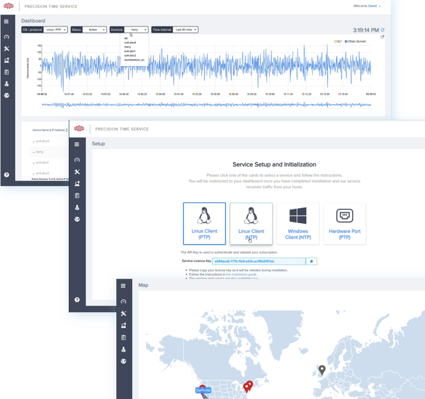
Edge Precision Time provides secure PTP and NTP Time as a Service for distributed enterprise applications on Platform Equinix®. The service uses redundant and strategically located GPS antennas, receivers, grandmaster clocks and the high-performance network backbone of Equinix Cloud Exchange Fabric™ (ECX Fabric™) to deliver secure, reliable and precise time synchronization.
During my work on this project I wore two hats – as a UI/UX Designer and as a UI Developer. As a UX/UI Designer I designed from a single page to a full-scale product by structuring and splitting information into sections, and stylized and unified design to match other services that I had been working on. I extended the product, and introduced new features and strong visual support.
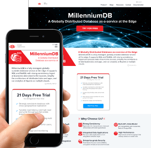
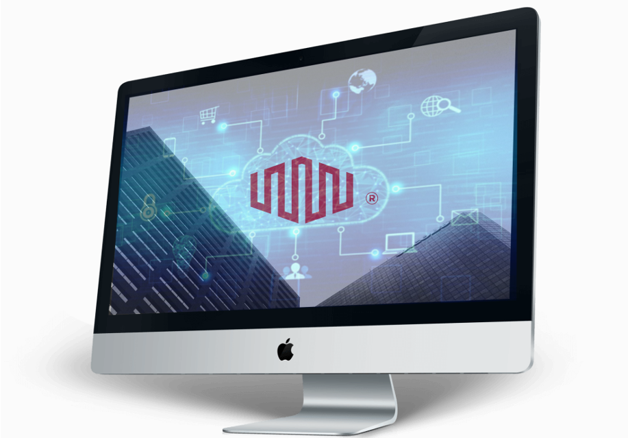
I created a Marketing Page Design where customers could access for an introduction, trials and subscriptions. The page had calls to action in multiple places that increased user engagement, and provided clear, structured information about the service and installation process. The page included designs based on different devices: desktop, tablets, and mobile phones.
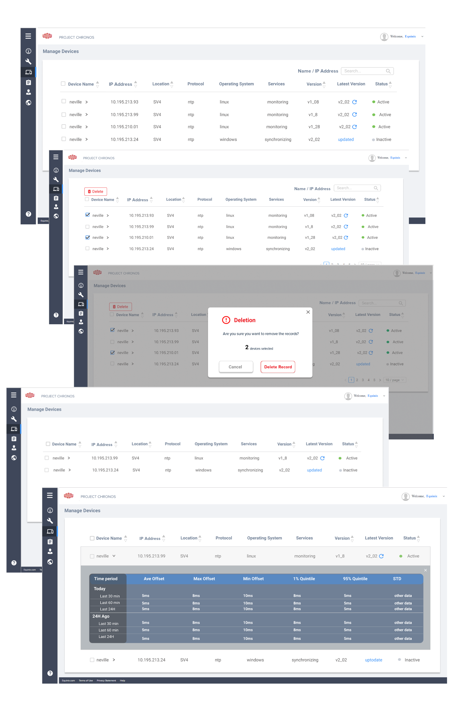
As a UI Developer I worked closely with engineers to make sure that the solution can be implemented and has a fast loading time. I redesigned the dashboard to modernize the style and match existing services. I developed tables with search function and filters, and added visual parts like cards, feedback, user actions on the Setup Page (mostly HTML, CSS) and a slider for the additional information. I modeled information architecture into navigation to represent new features and pages. The Manage Devices and Manage Pages were made with the help of an experienced engineer and database expert. In terms of UI, tables that can be manipulated (edit, delete, copy, select one, multiple, all, sort) were implemented by using HTML, CSS, javaScript and D3 library. The Map, which allows users to zoom in and out, select countries, states and cities with available devices and upcoming locations, was made with the use of D3 library. The Help Center with documentation was developed with HTML and CSS.
The new design of Edge Precision Time had fully developed the interface with easy access to the metrics on the dashboard and the possibility to customize the data. The UI design was developed based on the corporate style and matching Equinix services, which made the user experience clear and structured. I improved user flow by adding a structured left-side navigation bar that added convenient access to available options. Adding tables as a way of representing licenses and devices allowed users to see large scale information on one screen. Filters, selection and folding options made it easy to customize data and reach detailed information in one click. Adding maps gave visual representations of current locations and future extensions.
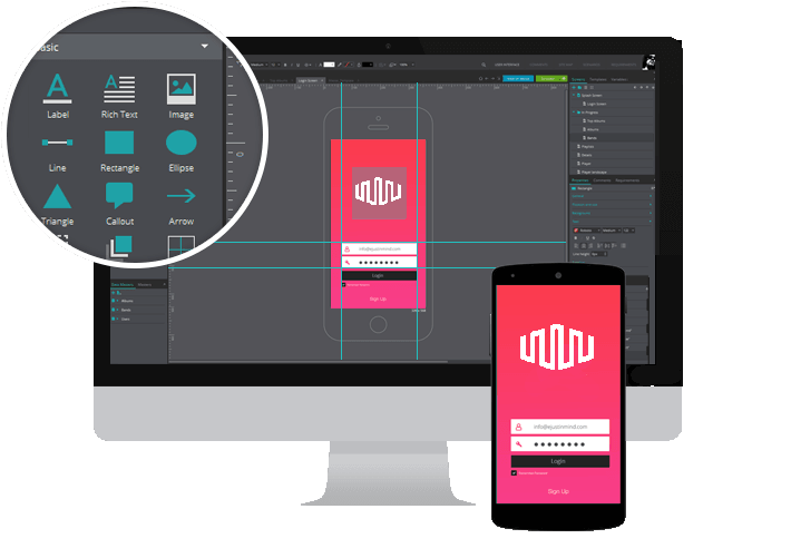
Figma
Adobe Illustrator
HTML, CSS
JavaScript & D3