
Donation Website
A donation website is a one-page sales pitch to make a donate


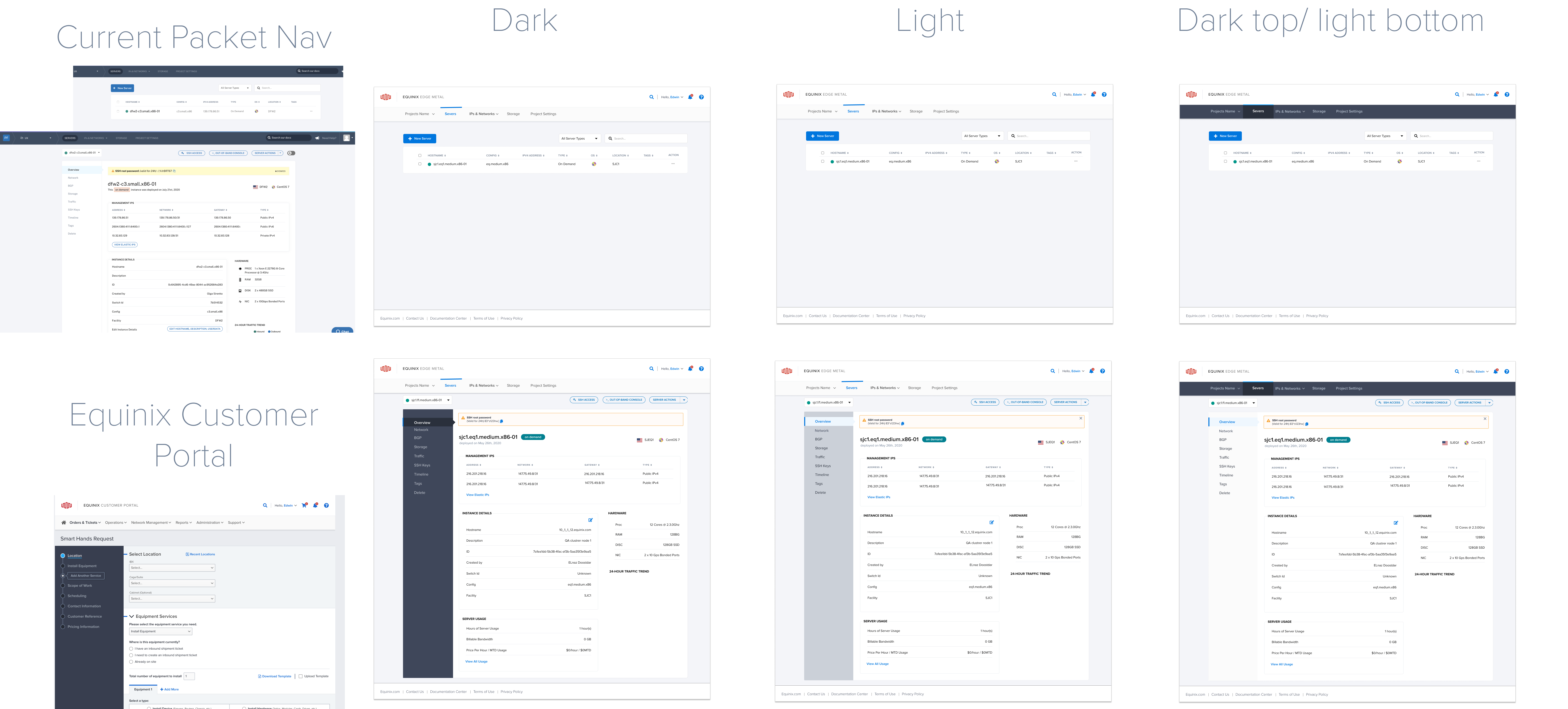
Packet empowers developer-driven companies to deploy physical infrastructure at a global scale. Packet was acquired in March, by Equinix, the global interconnection and data center company, to Accelerate Equinix Strategy to Enable Enterprises to Seamlessly Deploy Hybrid Multi-Cloud Infrastructures with differentiated performance and robust integration to the public cloud. To help make the vision for global, interconnected bare metal a reality, I've rebranded Packet as Equinix Metal™ and introduced new locations and features.
Develop Rebranding strategy that would allow Packet to adapt Equinix's branding style without becoming overwhelmed. Make Packet Portal function for optimal user experience.
Based on the time frame and importance of the introduced changes, two phase changes were made:
STAGE 1
STAGE 2
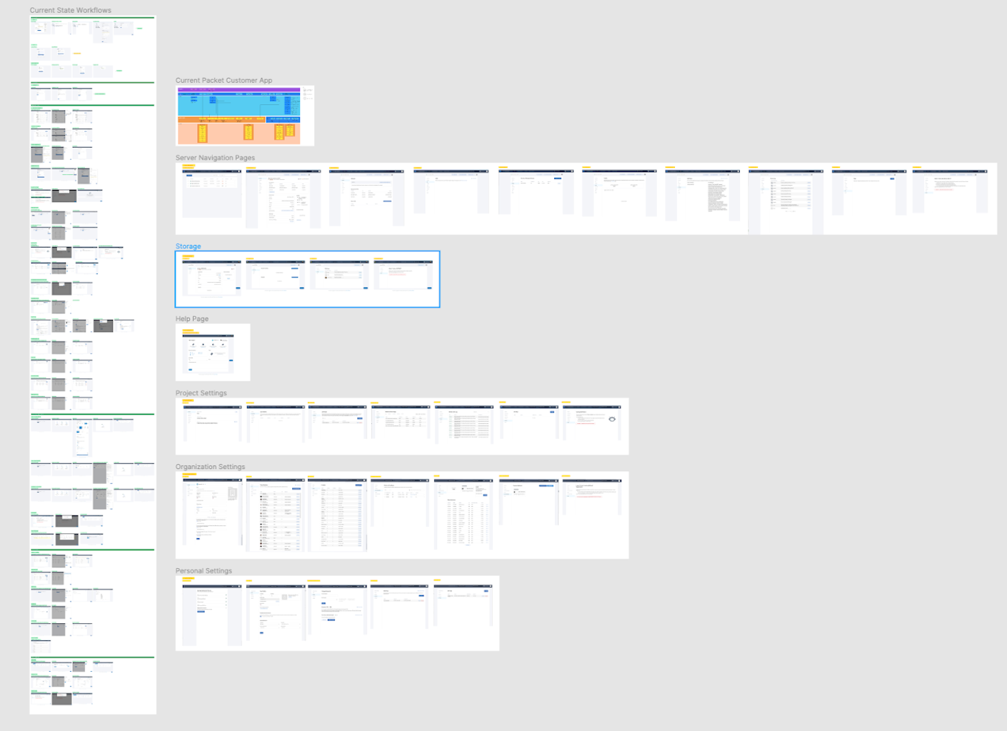
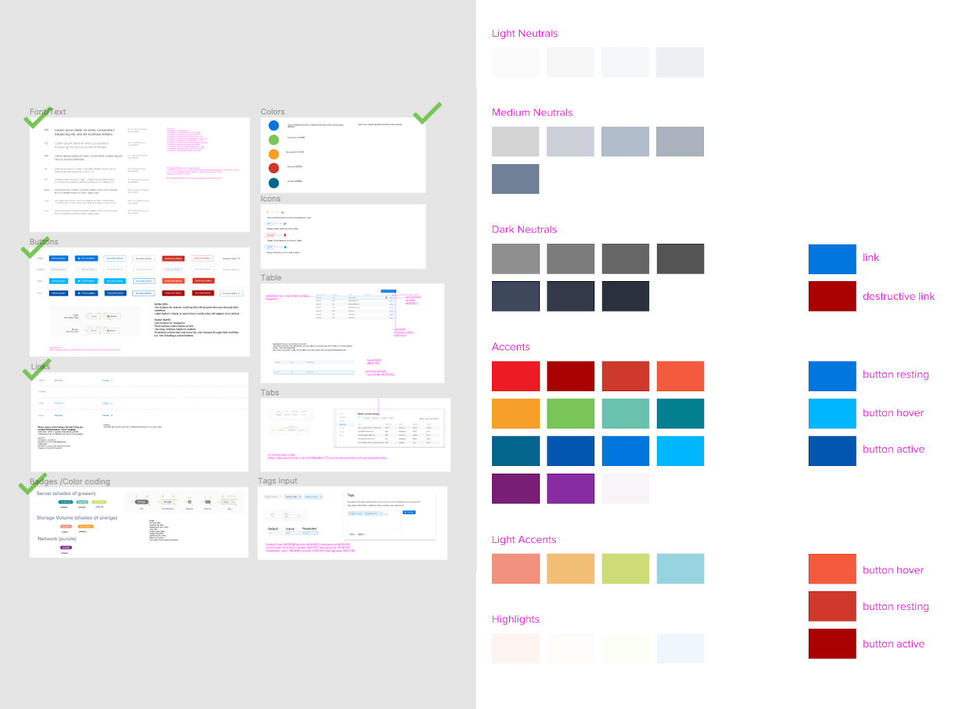
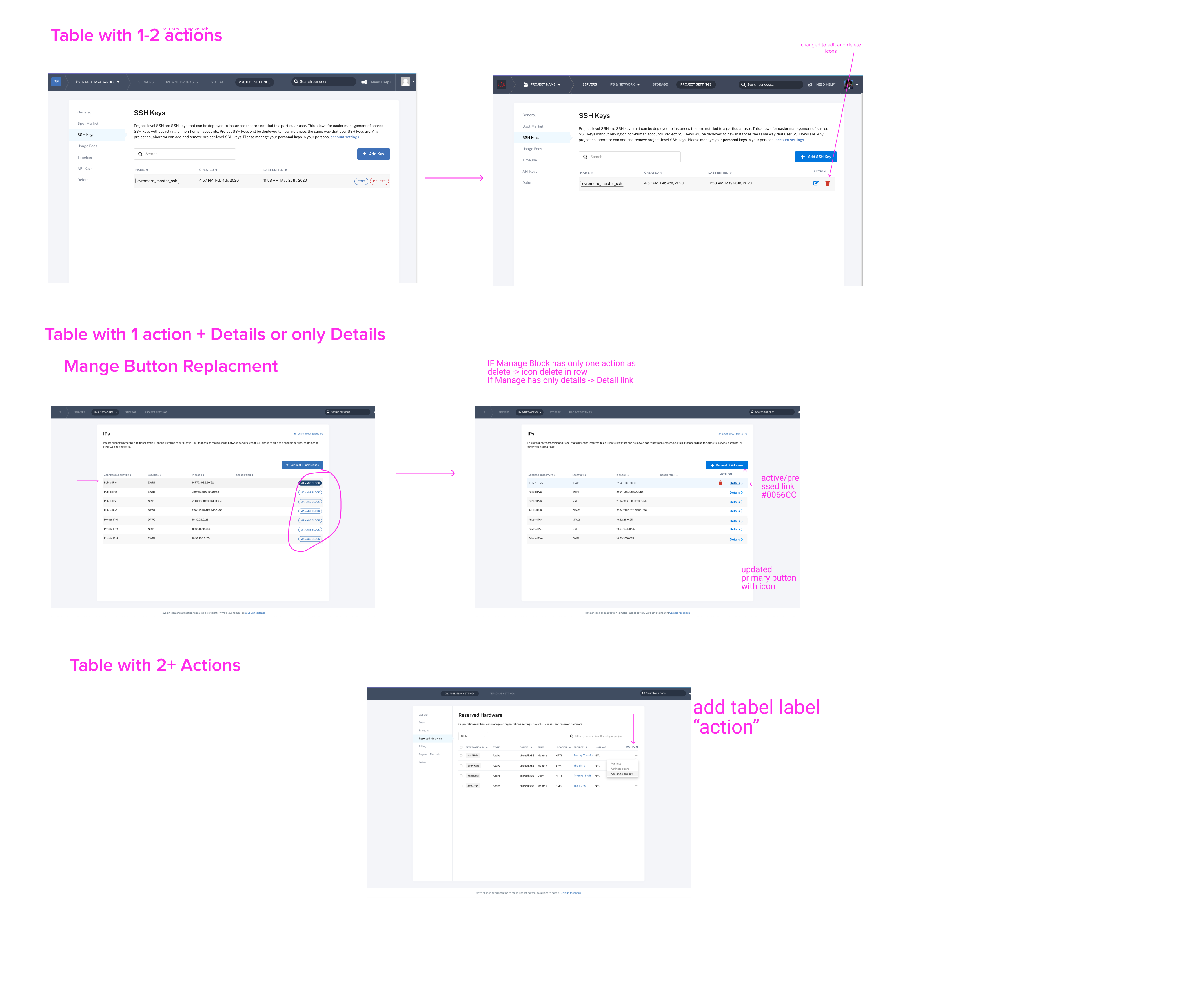
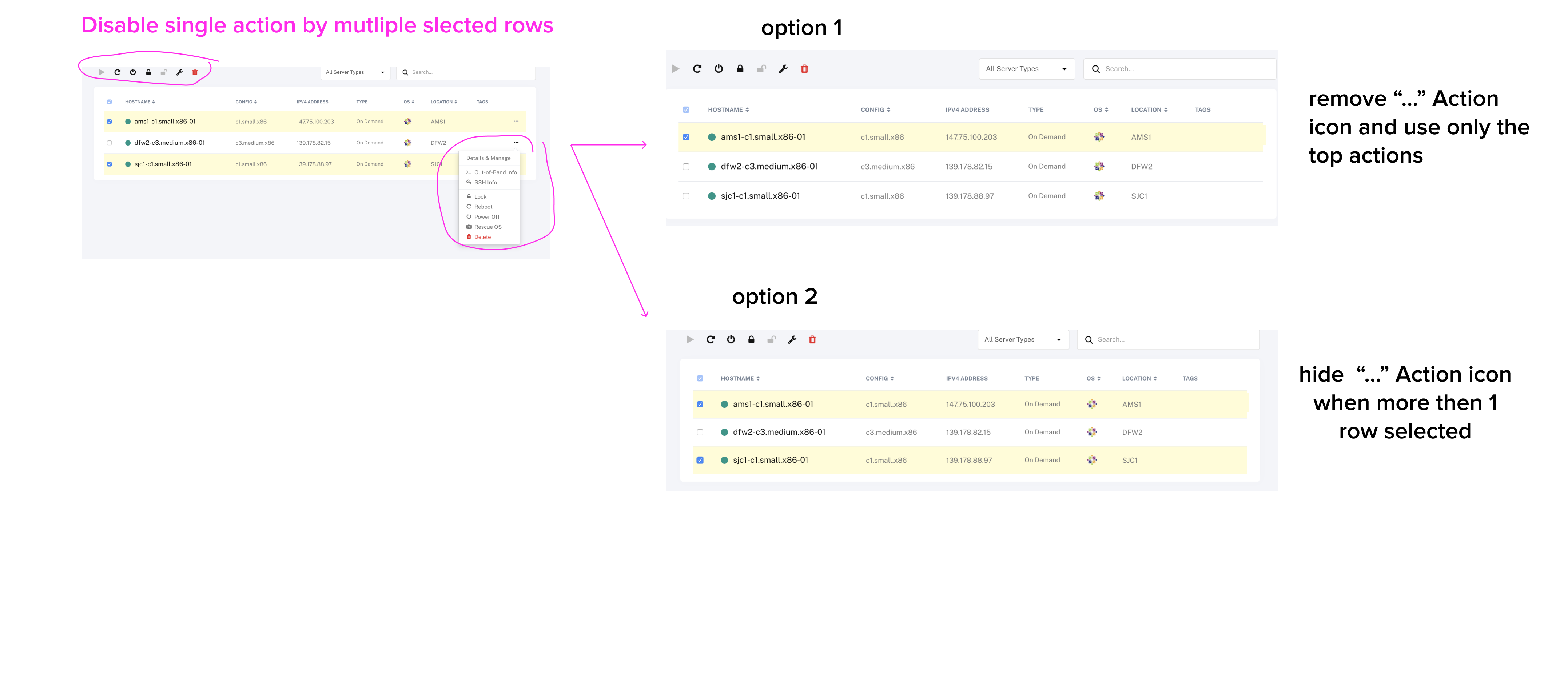
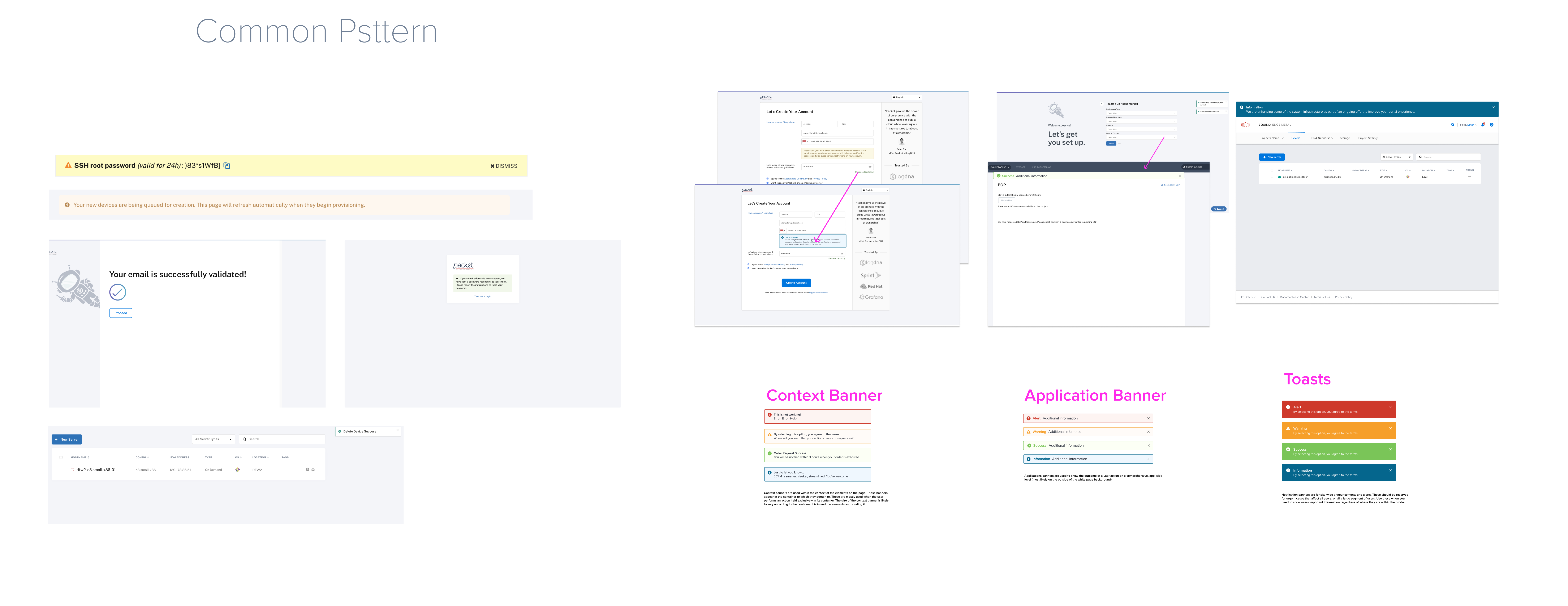
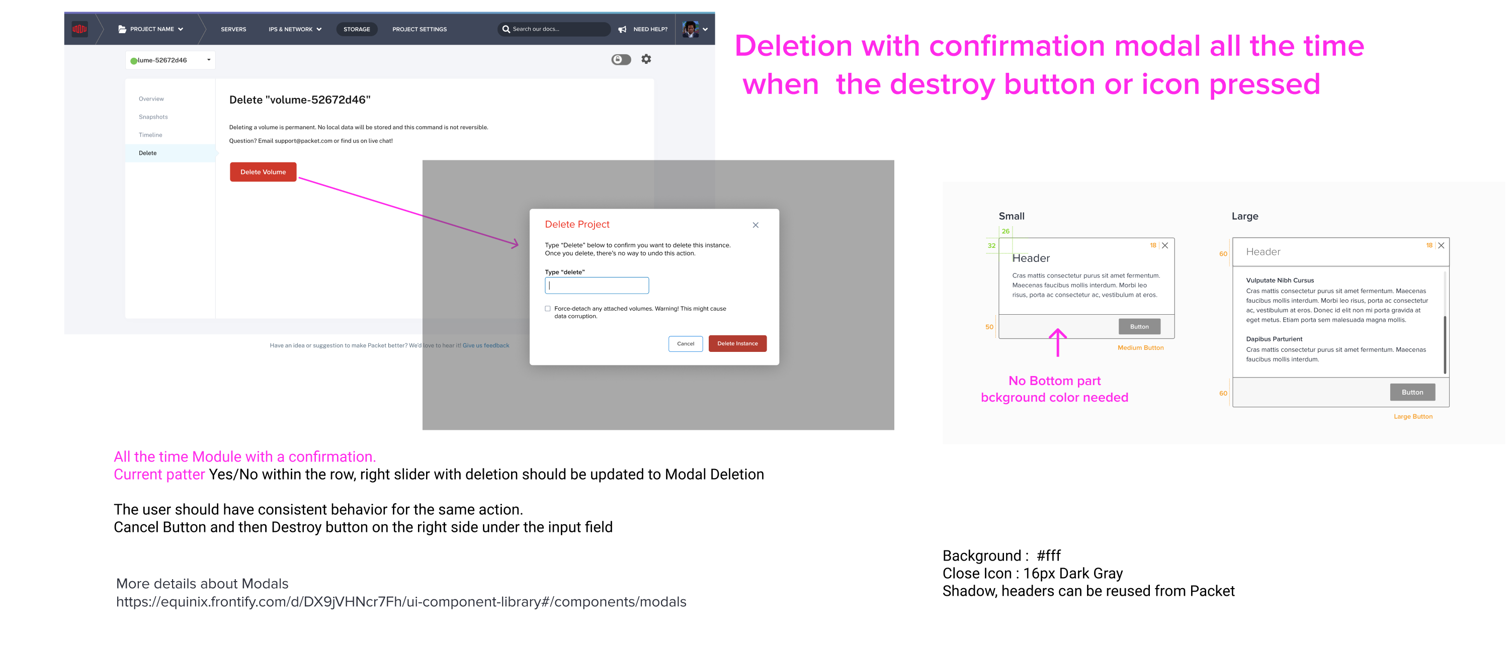
I lead the Rebranding efforts, which include discovery and analysis of all problems within the Packet Portal. I also design new solutions and adapt existing ones to create a unified experience, give a highly functional look and feel to the Equinix product. This process addresses key issues with the user experience to improve functionality and increase users' trust in the product.
I designed, organized, and reviewed all stages of the rebranding process, worked in close collaboration with managers, developers, illustrators, and UX writers to deliver high-quality, renewed design and functionality of a newly acquired startup and elevate it to the level of an enterprise.
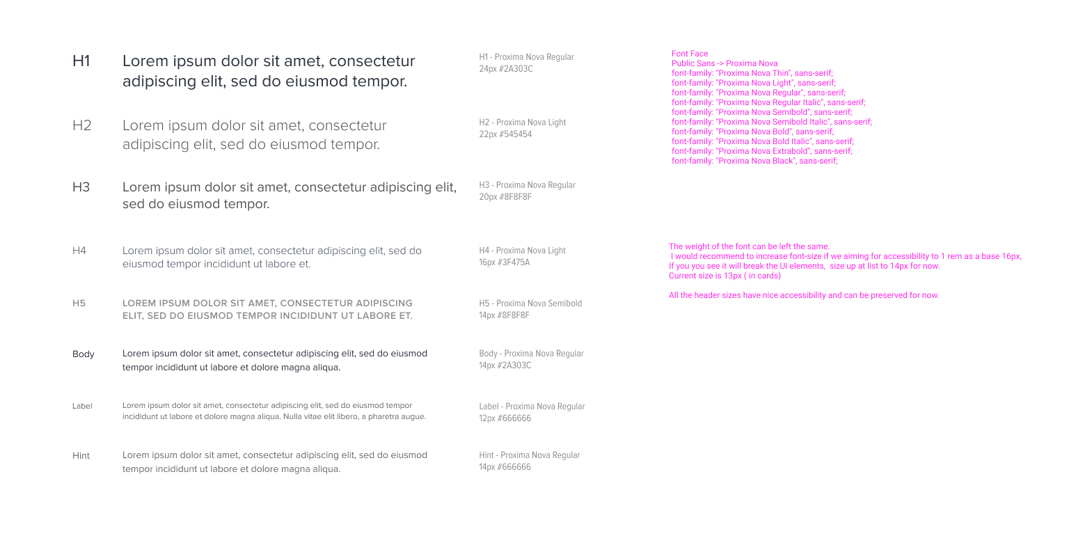
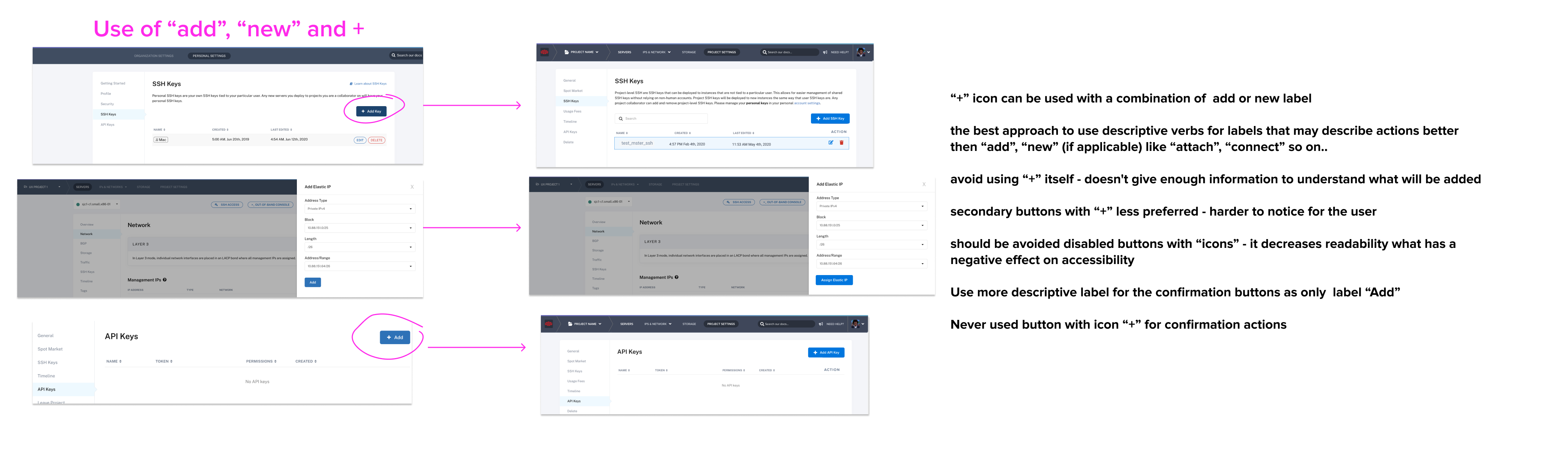
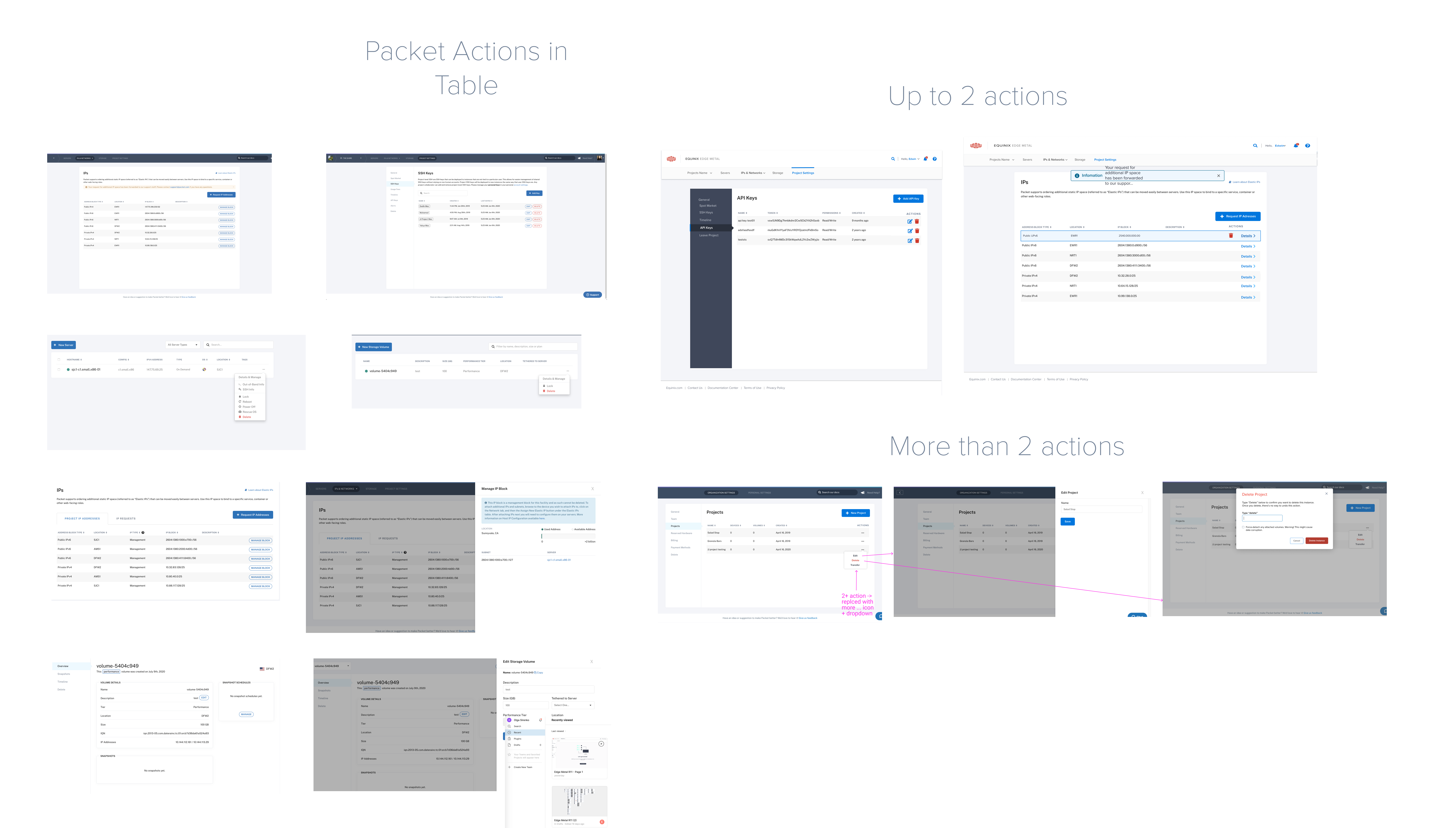
After six weeks of collecting feedback, testing discovered and analyzed current UI issues and introduced improvements. All the UI changes were designed in high-fidelity wireframes and set in a prototype with a description for the father developmen
Over the next three weeks, the UI was updated, tested and released in October.
Based on the released version, new feedback was collected from users and incorporated into the next phase of changes. This included work on more detailed elements, such as error and notification system, informational infrastructure, user behavior patterns and content, and updating existing tables, tabs, etc. The release is still to come ;)
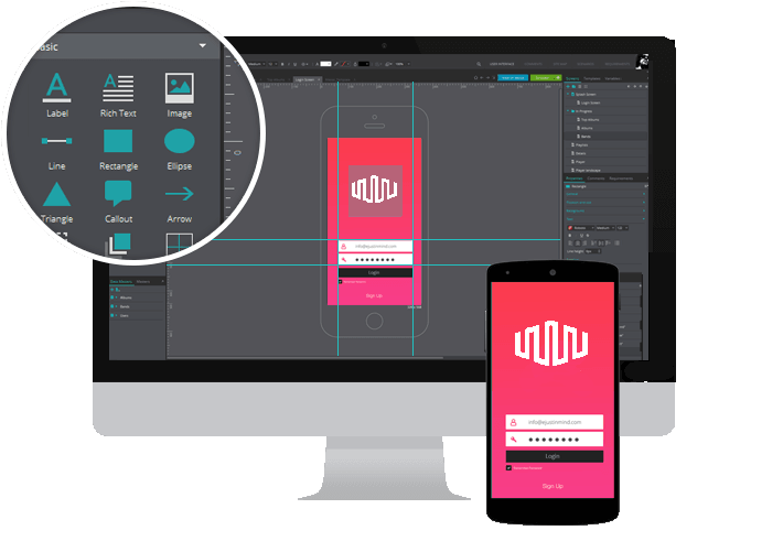
Figma